Pytorch metric learning, Part II: Analyzing embeddings with Vectory
Learn how to evaluate and compare embeddings from PyTorch Metric Learning models using Vectory's powerful visualization and analysis tools
Gonzalo Chiarlone
Engineering Manager

Learn how to evaluate and compare embeddings from PyTorch Metric Learning models using Vectory's powerful visualization and analysis tools
Gonzalo Chiarlone
Engineering Manager

Hi there! In Pytorch Metric Learning: An opinionated review, we introduced ourselves to the world of Python Metric Learning (PML) and experimented on training with two different losses: Triplet Loss and ArcFace Loss. Here, we go one step further and evaluate the embeddings that are generated from PML models with our latest Open-Source Software: Vectory. If you didn't follow the previous tutorial, don't worry! You can download all the files you need by clicking here.
Feel free to skip this part if you are already familiar with Vectory.
Vectory is a library that was designed by Pento's ML engineers to track and compare embeddings. Projects that require working with embeddings also require training models over several datasets testing different models to obtain the best results for each specific case. When the number of different experiments starts to grow, mistakes or time inefficiencies start to appear. Here is where the tracking functionalities of Vectory come in handy.
In addition, it is not always easy to compare two embeddings spaces to know which one is a better fit for your problem, especially if you are working with unlabeled data. That's why Vectory includes its own embeddings space analyzer, a tool that can compare both labeled and unlabeled data easily.
If you haven't gotten to know Vectory yet, you can read this blog for an overall idea of how it works. However, to follow this blog, just follow the steps mentioned in the tool’s README file.
Let's recap a little. In PyTorch Metric Learning: An opinionated review, we finetuned a ResNet50 twice, once with Triplet Loss and then with ArcFace loss, both times with the train dataset of Tiny ImageNet. We analyzed the results with the tools PML provided. Now, we are going to compare the embeddings obtained with each model in the validation dataset of Tiny ImageNet, using Vectory.
First, we have to register our dataset, both experiments, and both resulting embedding spaces. Fortunately, we can do this with a single CLI command:
We can check if everything is loaded:
Once we have loaded our embedding space, we have to create an index in order to run queries over this space. In the background, Vectory is loading the embeddings into ElasticSearch, using the column “image_id” from the csv as the key. However, you don’t have to worry about using ElasticSearch, Vectory will take care of it.
We can load our indices with the following command:
Here we are creating two indices using the default values of “model” and “similarity”, which are lsh and cosine. However, you can try loading more indices with different similarities and compare the results.
Before we continue to compare both spaces, it’s important to know that all these commands are also available through Vectory’s API. Moreover, we could also add this API into our training pipeline in order to automatically load experiments into Vectory and evaluate the results faster.
After loading everything into ElasticSearch and before visualizing both spaces, we should calculate the similarity between the spaces. This is one of Vectory’s main features because it gives you a metric to know how similar two embeddings spaces of the same dataset are, even for unlabeled data. It works in this way:
This calculation computes the ten nearest neighbors for every data point for both embedding spaces, gets the IoU for each group of neighbors obtained, and shows the distribution of the IoU values. It also calculates the mean of the IoUs to generate the Similarity number.
So, if we run the next command:
We should see the next output:
Which means the similarity between both spaces is 22.6 %. This means the spaces are different, which is what we were expecting because of the differences between the losses!
Extra: This Jaccard similarity calculation is very powerful because it gives us an overall idea of how similar the spaces are. We can use this, for example, to compare the evolution of an embedding space over a training and see if it’s worth keeping training. However, remember that this only looks at the 10 nearest neighbors, so two spaces can have very similar clusters but have a low Jaccard similarity. On the other hand, if the Jaccard similarity is high it is mostly possible that the spaces are similar.
Right now, we could just be happy with this result and conclude that both models give us different results, but then we wouldn’t know where the differences are and which model has a better fit for our problem. So now we are going to compare these two embedding spaces in depth.
Now, it’s time to use Vectory’s main tool: the Embedding Space Analyser. This analyzer is a space visualization tool, it integrates all the tools available in Vectory in one easy-to-use Streamlit. As with most of Vectory’s tools, we can access this analyzer by running the next command:
Then, we have to open http://localhost:8501 in any browser. There we can access the analyzer.
We start by selecting the tiny imagenet dataset and both embedding spaces. It’s important to note that if we want to change the model or the similarity, we must reload the embedding into ElasticSearch as a new index. We will also choose "labels" as the label to color the data points.
After submitting this request, we will see a 2D representation of both spaces, where each point is an embedding of an image colored by the label. Vectory lets us make these representations in three different ways: with UMAP, with PCA, and using a combination of both. Here you can see each representation:


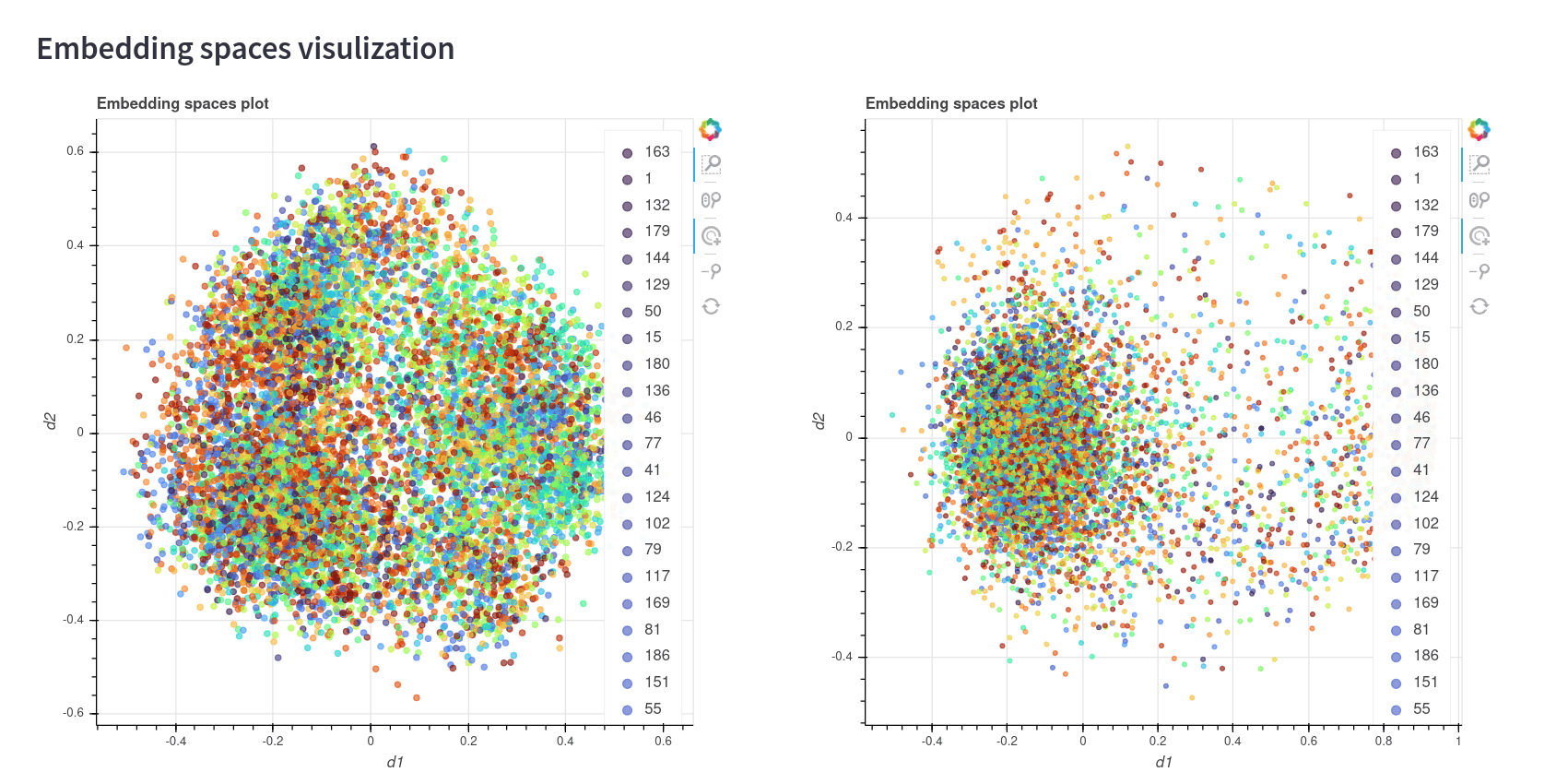
In the first two representations, we can see that the colors seem to be well clustered to a certain degree. However, the ArcFace model has a big cluster with a lot of points of different classes in the first two images. This may be because of one of two reasons: Either the model needs more training in order to converge, or the model doesn’t have a good fit for this dataset. It would be a good idea to train this model for more epochs and do the comparison again.
The third image, which is the representation using only PCA, doesn't seem to be a good representation of the space. This is something common, since PCA is not an algorithm that was made to see good 2D representations as UMAP.
Later we will see how we can know which representation is better. But first, let’s take a look at the similarity histogram below:
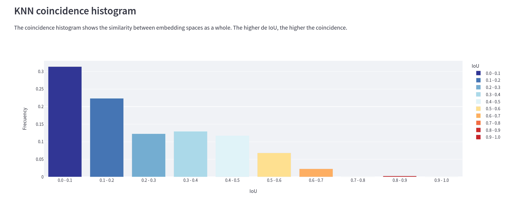
This is the IoU histogram between spaces. It tells us, for example, that for ~30% of the embeddings, the IoU of their ten closest neighbors has a value between 0 and 0.1. Here we can conclude that not only do the embeddings have a different distribution in each space, but the distance between two given embeddings is different for each of the spaces. This is what matters when we are working with embeddings, not where they are but which ones are near. Not their absolute position but rather their relative position to other data points.
Extra: We can also see this graphic when we run the "compare" command, by adding the flag --histogram.
Okay, so we know that each model gives us a different embedding representation for each space. But now we want to know what the differences are and their similarities.
Well, here is when the 2D representation comes in handy. We are going to reload the 2D spaces, but now we choose “coincidence” as the label to color the points. This is what we get:
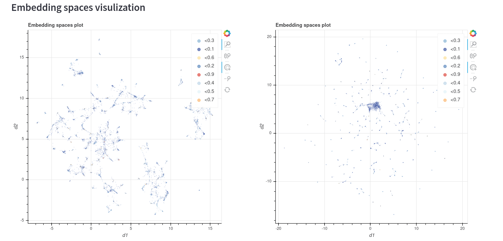
So, it's everything blue? Let's zoom in and find out:
As you can see, not all the points have the same color. This color distribution correlates with the coincidence histogram, so basically the blue points are the ones with the lowest similarity between the models and the red points are the ones with the highest similarity. If we want to go one step further with this comparison, we can also run a KNN query over both spaces and compare the matches and differences:
This tool shows us the result of the query in two different ways: As a dataframe with all the metadata we loaded in the csv and the location of each result in the 2D representation of each space.
Let's take a look at the dataframe. The results of the query show us that most results correspond to images that belong to the class “190”, which means that even if the spaces don't have a big IoU similarity, both seem to perform great in differentiating the classes. However, we shouldn’t jump to conclusions so fast, running more queries would be a good idea.
We can also see the location of each point in each model in the 2D representation. This lets us know how reliable this 2D representation is. Here we can see that in both models the top 10 nearest neighbors (which are calculated with the original dimension of the models, not the reduced dimensions) are close to the queried point, which tells us that both 2D plots are a good representation of the spaces.
After all this analysis we made, we are now able to make certain statements:
The first conclusion is the most interesting of all, since it would be very difficult to make this statement without using Vectory. We could, for example, start making k-neighbors queries and see the similarities between the results of those queries in order to know this, but that would take a long time and could be a very biased statement depending on the queries. With Vectory, we only have to run the "compare" command to find the answer.
You can also read
Master PyTorch Metric Learning with this comprehensive guide. Compare Triplet Loss vs ArcFace on TinyImageNet, explore the library's powerful modules, and learn how to generate high-quality embeddings for your similarity-based applications.

This article goes through a proven methodology used by top professionals in the industry to efficiently structure machine learning projects

A 1% improvement in forecast accuracy might not sound dramatic, but for retailers managing thousands of SKUs, even small gains compound into massive operational impact. Learn how we improved forecast accuracy by 25% for a nationwide convenience store chain.
CONTACT US
Work with Pento to turn promising AI experiments into systems that perform reliably in production, with the right architecture, delivery model, and engineering support.